Although often overlooked, Graphic Design is incredibly integral to government work. Federal government design specifically relies on past and modern-day successes of good design practices in America.
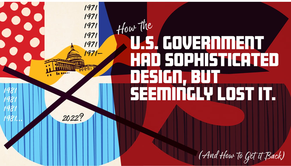
At one pivotal moment in history, Graphic Design in America was plagued by generic and lackluster designs. However, everything changed when President Nixon introduced the Federal Design Program, bringing attention to the importance of Graphic Design and elevating the concept of visual graphics. For an entire decade, thoughtful Graphic Design became a national priority, but unfortunately, this progress gradually faded over time.
Designing for the government presents several challenges, whether it's a proposal, whitepaper, website, etc. One of the major obstacles is the need to meet strict government requirements and conform to established design conventions, all while striving to create a visually appealing and engaging design.
In this article, we will show how the past can help us create visually appealing and thoughtful government designs in the future. To understand this, we will dive into three key areas:
- Moving from boring to bold
- Investigating good federal design
- Critiquing federal design
Understanding these key areas will help us implement visually bolder and more effective Graphic Design throughout our government work.
With the arrival of President Nixon, America witnessed a surge in consumerism driven by the growing popularity of television, the widespread use of photocopiers, and the introduction of credit cards. Despite the thriving economy, design and visual aesthetics were not on the political or government agenda until President Nixon changed this.
In 1969, Leonard Garment–a liberal advisor to Nixon and lifelong arts advocate–wrote a memo outlining why he thought “support for the arts is increasingly good politics.”
“In our country, cultural affairs represent an area of under-attention as compared to our technology. By providing dramatically increased support for cultural activities, you may gain increased respect from groups which have hitherto not been favorable to this administration.
For an amount of money minuscule in total budget terms, you can demonstrate your commitment to “reordering national priorities” and to emphasizing the quality of life in our society.
Federal design fell under the National Endowment of the Arts (NEA). As a result of Leonard Garment’s advice, Nixon doubled funding to the NEA. Through this program, President Nixon brought an influx of $40 million dollars to subsidized arts, which resulted in major design revolutions for government agencies, including NASA, EPA, and the U.S. Postal Service. It was bold and transformative. The Federal Graphics Improvement Program brought private critiques into assemblies and conventions where designers reviewed several new “groovy” designs. Much of the design focused on how to cut down paper production, the use of color, and efficiency prioritization.
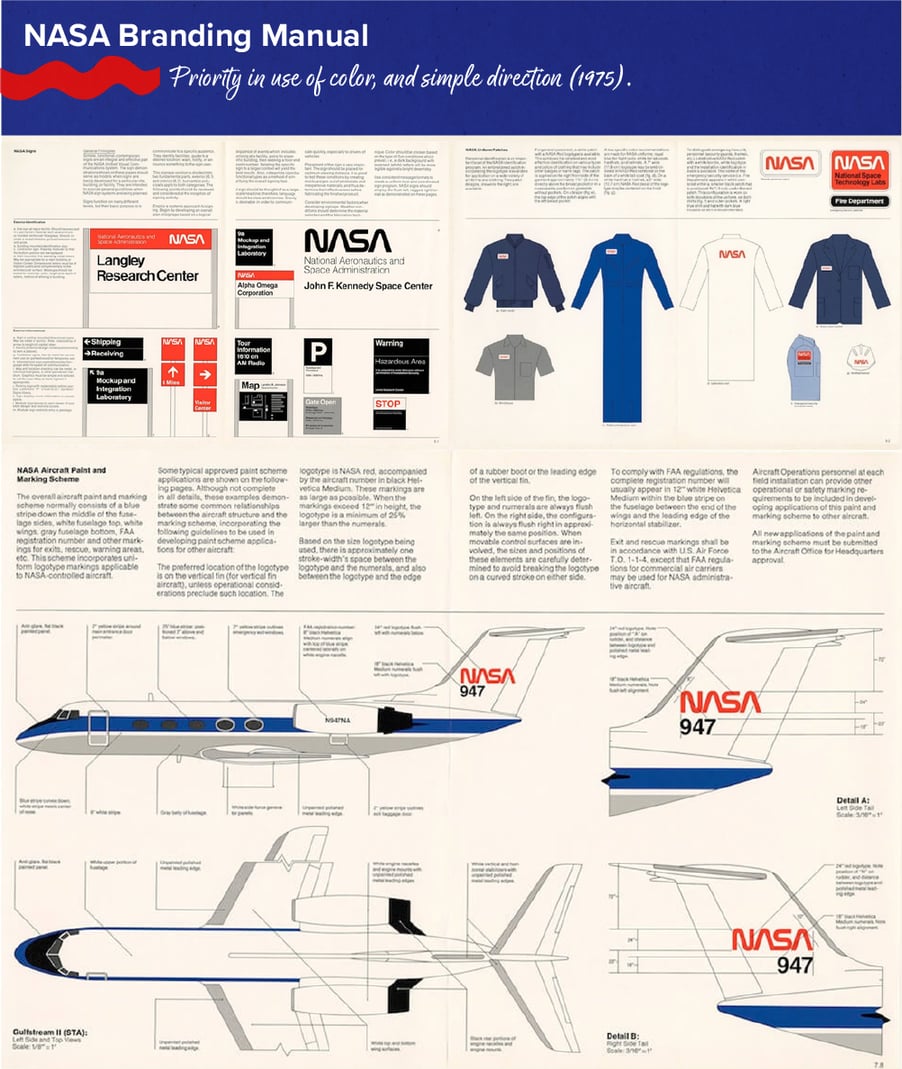 Image Source: 19 Delightful Bits Of Vintage Graphic Design Inspiration — Smashing Magazine
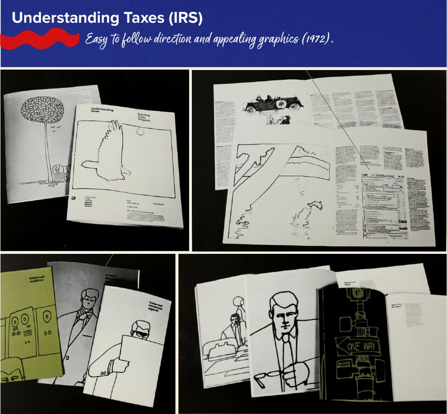
There were projects like the National Park’s “Minifolders,” which reduced the size of brochures and clarified their formatting; the Internal Revenue Service’s graphics program, which helped recruit new employees and clarified the taxpaying process through redesigned forms and instructional booklets; and the U.S. Postal Service’s graphics standards manual and its Raymond Lowey-designed eagle emblem.
Unfortunately, the successes of the Federal Graphics Improvement Program slowly fizzled out and ended in 1981. Graphic support from private agencies was no longer needed, some of which ceased due to lack of funding.

The mission of the Federal Graphics Improvement Program from 1971 to 1981 was to save money and time while enhancing government communication. They fulfilled their mission through research and analysis to create visual systems tailored to agency-specific needs. When you think of Federal Graphic Design today, it isn’t the most communicative or engaging visual, to say the least, and has clearly regressed over the years.
In truth, there are a lot of moving parts that need to be pieced together to achieve good design. Design should be engaging and persuasive. A prime example of engaging and persuasive federal design can be found in presidential campaigns. For instance, President Obama’s first presidential campaign in 2008 resonated emotionally with his audience and was highly persuasive. Another example is President George W. Bush’s second presidential campaign and the use of a cinematic ‘W.’ These examples have proven to be memorable and much higher profile than federal agency design, although they are used in the short term.

Image sources: Great Campaigns: Obama's 2008 Presidential Campaign and the History of Graphic Design: Presidential & Chanselorship Election Campaign Posters
There are federal agencies that excel in good design, showcasing their creativity and effectiveness. The National Park Service, for instance, adopts a simple yet intuitive approach in its federal design, from its shield-like logo to the well-designed signage that guides visitors through the parks. On the other hand, the U.S. Army takes a militaristic approach in its design, without being overly aggressive. Their branding effectively communicates with their target audience in a straightforward and impactful manner.
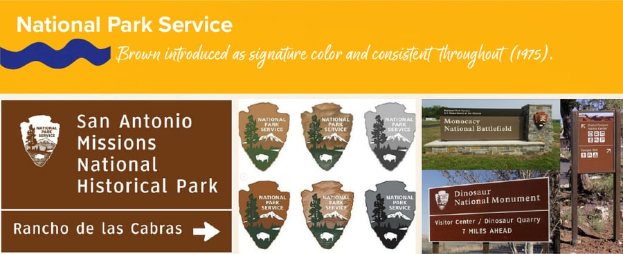
Image Source: The National Park Service Instagram
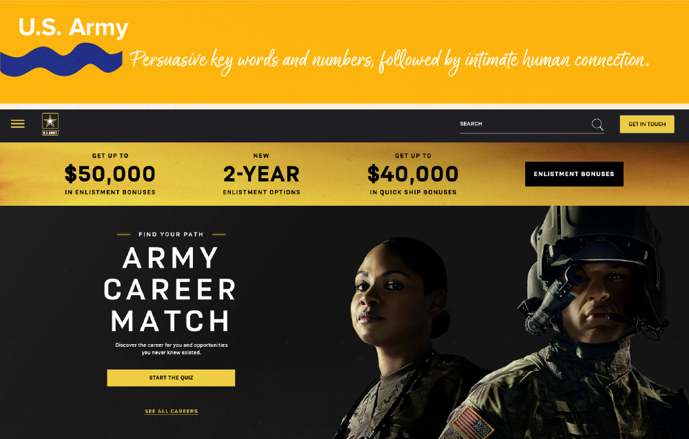
Image Source: U.S. Army website
Good federal design isn’t limited to printed material and graphics. It also includes digital services. The websites of the U.S. Department of Education and Homeland Security boast a sea of information, all neatly organized. The takeaway from these examples is that they focus on targeted audiences with intuitive, clear, and conceptual design. When your goal is unambiguous, it is easier to create effective designs. When you don’t have a strong concept, the resulting design is unlikely to be as impactful or successful.

To have positive experiences in federal design, we must learn how to critique the work. What does this mean? Critique in this context is not necessarily art-related. It starts with simply identifying user needs. Most of the examples we covered above achieved a lot with less. Designs can be reused without having to reinvent the wheel each time. We should look for accessibility in design, even if that means letting go of a more creative or bold design that we are attached to. If it is not useful or necessary to your users, do not include it.
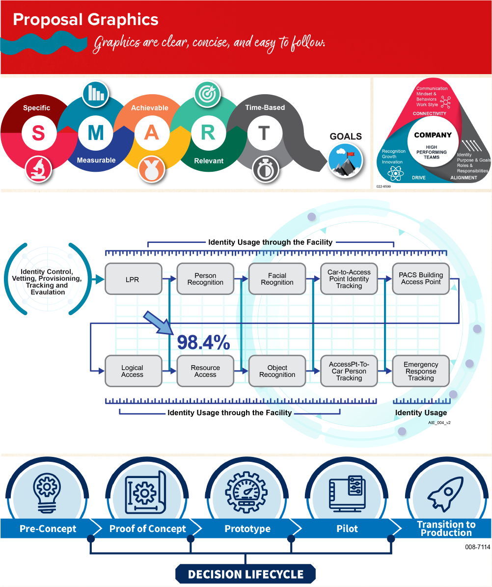
Sometimes, design is determined based on needs. For example, the National Park Service’s road signs are something we see all the time. They are designed for easy communication and consistency. This is an example of a useful, practical design that trumps complexity. In government proposals, graphics should push the envelope of how design can create intent and purpose without superfluous elements. The graphics should be persuasive, clear, and compelling, in addition to being creative. Be sure to download our Initial Design Critique checklist to assist you in visualizing your graphics.
Conclusion
In conclusion, we should look to the past for inspirational design images and ideas like the examples above and allow them to influence how we create successful federal design today. While dated ideas of what proposal graphics and federal design may still exist, we can use the key areas discussed above as references to create good design.
There are patterns to good design and various useful resources, such as the KSI’s Initial Design Checklist above. If you are looking to outsource your graphics, the design team at KSI specializes in government proposals and marketing materials. Remember, the next time you design for the government, everything for you to succeed is right there, in the past and the present.
Article Sources:
- The 1950s - American Culture & Society - HISTORY
- Presidents - The White House
- Nixon, NASA, and How the Federal Government Got Design
- The American Election - Designing A Presidential Campaign (fiasco.design)
- How The US Government Got Hip Graphic Design — And Then Lost It - American Moment
- The American Election - Designing A Presidential Campaign (fiasco.design)
- Resources – GoDIG
- Why we care more about effectiveness than efficiency or satisfaction - User research in government (blog.gov.uk)
- John Waterworth - User research in government (blog.gov.uk)