Think of the last time you saw something and immediately realized you were going to enjoy it.
It may have been an amusement park ride that towers over the parking lot or a recipe brimming with flavors you cannot wait to taste. First impressions are oftentimes built on visual presentation. What makes something appealing? What draws you in? What gets you excited to learn?
In the proposal world, a proposal response should invoke the same interest and intrigue in an evaluator. When an evaluator sits down to read your proposal, the last thing you want them to feel is overwhelmed by a disorganized response or underwhelmed by pages of text without any visual aids. When creating your proposal response and organizing the final product you should ask yourself:
“Is this something I would enjoy scoring or could score easily?”
The visual presentation of your proposal can grab an evaluator’s attention, and once you have their attention, you should do everything in your power to maintain it. What steps can you take to ensure that your proposal will stand out to an evaluator? Acing the evaluation is not just about addressing the evaluation criteria; you must also make sure that your response is properly formatted and that it does not make the evaluator’s life more difficult.
In this article, we'll discuss simple but effective techniques you can use to assure that the evaluator will be able to digest content and easily read through the entire proposal response.
Identifying a solution to meet the client’s needs is half of the proposal development battle; however, even if you have the perfect solution, if your response is a mess, the impact of the solution may never register with the evaluator. An important thing to keep in mind is that you, as the proposal respondent, want to make the evaluation as simple as possible.
You can help your proposal stand out to evaluators by structuring your response based on the RFP requirements and numbering sections to mirror the solicitation. If you don’t follow the structure set by the customer, then you will make it that much more difficult for the evaluator to comb through your response to find the information they are looking for.
Here is a Helpful Checklist to Ensure Your Proposal Stands Out to an Evaluator:
- Present a neatly prepared document with a proper amount of white space, callout boxes, and graphics. You do not want to give the evaluator a headache by presenting a disorganized proposal.
- Ace the evaluation by strategically placing important information in callout boxes and demonstrating major themes or solutions using graphics to catch the evaluator’s attention and make a lasting impression.
- Bring your benefits to the front of a section. Bold the benefits.
Now, let’s discuss how to properly organize your proposal response so that it will catch the evaluator’s eye and leave them with a favorable impression that your company can get the work done.
Organize Your Proposal to Follow the Request for Proposal (RFP)
The KSI Advantage© Capture & Proposal Guide recommends that the Proposal Manager should aim to develop a detailed proposal outline within 48 hours of the release of a draft or final RFP. Ideally, the outline should be available for the Proposal Kickoff Meeting.
Outline development involves extensive dissection of the RFP. The following steps provide guidance to developing a complete and compliant outline:
- Step 1: Organize sections according to the proposal instructions in Section L, unless otherwise specified by the RFP.
- Step 2: Where Section M does not align cleanly to Section L, add in additional headings.
- Step 3: Next, add in any relevant Scope of Work (SOW)/Performance Work Statement (PWS) mapping (typically in the Technical Volume or Section), and other mappings as necessary.
To facilitate evaluation, follow the order of the RFP, even if the order does not make logical sense to you or your team. Use language very close to the RFP to make the compliance mapping easy for the evaluators. Consider including the RFP section mapping in parentheses after each heading to further facilitate the evaluation.
Before distributing the outline, the Core Team (Capture Manager, Proposal Manager, and Volume Managers) should review it for responsiveness, completeness, and logic. The following are typical review questions:
- Is the outline compliant with the RFP instructions?
- Have all requirements been identified?
- Are the page allocations consistent with the RFP’s evaluation criteria?
- Is anything missing?
Once you are finished and it is time to transfer your outline into the writing templates, you will also want to include RFP reference numbers under or next to each heading to ensure evaluators can follow along and understand which requirement the response language is addressing. For example, if you are responding to Section 3.1 – 3.7 of the PWS requirements, consider the following options to clearly tie your header back to the requirements:
Option 1:
2.1 Technical Approach [PWS 3.1-3.7]
Option 2:
2.1 Technical Approach
PWS 3.1 – 3.7
Formatting your response to mirror the RFP requirements may sound like a no-brainer but it's no easy task. It is crucial to include RFP reference numbers under or next to each heading (as demonstrated above) to ensure evaluators can follow along. This is one reason why developing a detailed outline is critical.
If you properly align your sections with the requirements they are addressing, the government will be able to smoothly navigate and evaluate your proposal. If it is easy for the evaluator to follow along and your solution and benefits stand out, then it will automatically make your proposal easier to score.
Keep in mind that an evaluator has numerous responses to read through, you do not want to be remembered as the response that took forever to review! If your response is difficult to follow, you also run the risk of an evaluator missing the critical points buried in the proposal.
Evaluators Are Affected by the Look of a Proposal
Evaluating proposals is tiresome work, so do your best to avoid making an evaluator’s job even more difficult by creating a disorganized and messy response. To ensure that your proposal is read and processed by an evaluator, consider the following best practices:
1. Put customer benefits upfront.
Make sure they are the first things an evaluator sees in each new section. The response is not about your company’s offer. The response is your opportunity to detail all the benefits your company can provide the customer and how valuable your solution is. Common benefits typically include performance, schedule, and time or cost savings.
The customer should know about your solution’s ability to reduce risk or provide a seamless transition. It is a possibility that the evaluator will skim through the first and last paragraph of your response to summarize all the data contained in that section. Make sure that they digest the key points of your solution by putting them at the beginning of the section!
2. Write effective action captions and theme statements
Theme statements are short articulations to the customer about the main point in a proposal section. Typically, theme statements link a discriminating feature to a benefit associated with the section an evaluator is about to read. Theme statements are used at the beginning of any major section and so long as they are used consistently in the proposal (at the same heading/section levels), they help the evaluator take away the most important points from that section.
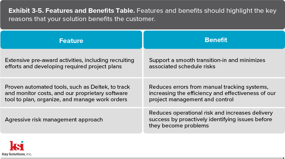
Action captions are sentences used after each Figure/Exhibit number and title. When used properly, action captions help define why a graphic is important or what about the graphic is important. The best way to do this is by incorporating key features and benefits that resonate with the customer into each action caption as it relates to the associated graphic.
Below is an example of a Feature and Benefits Table from the KSI Advantage© Capture and Proposal Guide, with the exhibit number, title, and relevant action caption.
3. Properly format the response
Our minds naturally believe that symmetric elements equal organization. If you imitate the organization of the RFP and align your proposal to its structure, you will ensure the evaluator knows where to find the corresponding solution.
4. Create clean and easy-to-follow graphics or visuals
If an individual finds a design or graphic too complex, they will simply look for something that they recognize. You want your graphics to be easily digestible. Graphics shouldn’t be confusing! They are there to help you illustrate the story and any processes you are proposing.
Collaborate with the Design Team to Improve the Look of your Proposal
It is extremely important to keep the desktop publishing (DTP) and Design team in the loop during the proposal development process. We suggest inviting the DTP/Design team members to the Kickoff Meeting and to regularly scheduled status calls to promote awareness and collaboration.
The design of your proposal needs to be communicated within your team from the beginning. The design team is responsible for creating the design, template, graphics, and finalizing the look of the proposal response. Proper collaboration with the DTP/Design team(s) during the proposal development process ensures that the design is consistent throughout the proposal and the benefits and solution are highlighted appropriately.
Don’t overlook the graphics process; it is there to help you develop a visual the evaluator can understand without feeling lost by vagueness or confuddled with an overload of information. A graphic is supposed to serve as another way to demonstrate your solution and benefits while also highlighting what is important to the customer.
You also need to create graphics that pull in the reader and are relevant to your overall story, while ensuring the concept is easy to grasp. Many times, I have seen busy graphics that are packed with text, arrows, and icons—the message or importance of busy graphics can quickly become unclear.
The last thing you want is for an evaluator to ask themselves, “What am I looking at ?” The graphic should be easy to digest and understand, in addition to being aesthetically pleasing.
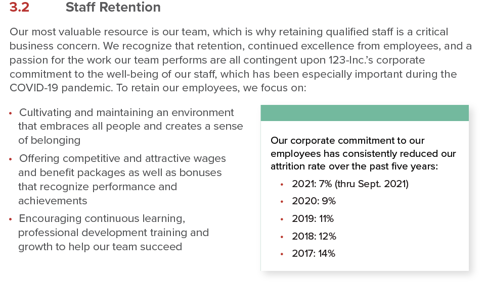
Another effective design technique is to place proof points within callout boxes throughout your response. Make sure there is a benefit in the callout box, as it will probably be the first thing the evaluator is drawn to read on the page. Well-articulated benefits are concise, easy to understand, and when used in a callout box, pop off the page.
An effective callout box gives you the opportunity to let the evaluator know that you understand the requirements and care about providing the right solution to their problem. Take a look at the following examples of callout boxes.

Be sure to maintain customer-focused writing. The response is not about your company, it is about the customer, their concerns or issues, and how your team can solve them. Also, consider powerful proof points. If you believe that your proof point gives you a competitive advantage—put it in a callout box next to the relevant or related content on that page.
In the example below, you can see how a proof point is illustrated effectively in the callout box.
Conclusion
Make your proposal responses easy for an evaluator to score. If your proposal response is organized to follow the RFP structure, the evaluator will be able to locate your solutions and it will reassure them that you understand their needs, desired outcomes, and most importantly, their vision for the contract. Remember the following:
- Organization: As an evaluator, they will feel more comfortable reading an organized response. The evaluator will naturally think proper organization implies understanding of their concerns. It is possible to gain a competitive advantage over the design of a proposal, so avoid sloppy and disorganized content that will leave the evaluator with a bad impression.
- Layout, format, and visual appeal: To catch the evaluator’s attention, put benefits at the front of your sections—cut to the chase—clearly showing you understand the issue and have the best solution.
- DTP/Design team involvement: It is also important to be in constant communication with the DTP/Design team. Use your graphics to support and illustrate your solution and/or approach. Try to use clean lines and shapes, and to help depict a clear visual design and message.
To ace the evaluation and increase the odds of winning a bid, we must think like an evaluator and make the evaluation as straight forward as possible with clear and memorable hooks.
Make the proposal response visually appealing and straight forward for the evaluator to read and score. Thinking like an evaluator and ensuring that your response can be easily navigated is a great head start in differentiating yourself from the competition.