Have you ever asked yourself if an evaluator gets bored reading your proposal? To break up the sea of text, you use proposal graphics. But are your graphics also boring?
Effectively rethinking the relationship between a writer and a graphic designer can create exciting new grounds for memorable visual aids. At their best, a writer and a designer are descriptive and creative while making sense of information. With an established common language, they can create the most effective visual storytelling.
Successful collaboration between writer and designer enables them to look for cues where design can potentially set the proposal apart.
It is important to remember that we often face many restrictions during proposals, including page count, font size, or even margins, but ultimately design itself is rarely held back. To make proposal graphics more engaging, stand out from other submissions, and seamlessly transition with the text, we need to rethink the relationship between writers and designers, look for similarities and next steps, and translate the clues to create a stronger toolkit. It is up to the writer or proposal manager and designer to strategize collaboratively.

The Writer-Designer Relationship
Traditionally, a writer or proposal manager sends the designer a graphic request, and the designer creates the graphic. Their relationship is straight forward, separate, and transactional.
Paul Rand, an influential American Graphic Designer who focused on corporate design, described the difference between management training and designer training in his essay Good Design is Goodwill as managers, "being trained from a business standpoint and research. A designer is trained from roots in painting and drawing.” A writer or proposal manager is often seen as a management role in the common setup of proposal work.

While it may seem like a relationship destined for incompatibility because of differences in training and process development, the writer’s process is to create themes for the proposal to best fit the client and bid. The designer is often removed from that process. They are both independent from and dependent on the writer. It is easy to see where this scenario can be problematic.
"Information is often lost going from a writer to the designer. This is especially true because as designers we are usually working with limited information about the proposal subject."- Jeannette Calderon, Graphic Designer at Key Solutions, Inc.
The disconnect in the development process can lead to misalignment. Both parties should be equally responsible for communication and availability as they are vital to supporting theme creation.
So, what if the process was changed?
It is easy to see that a writer and designer aren’t that different. They both have creative jobs and are telling stories through their craft. It is not always the case that a writer, trained to professionally craft a proposal, and a designer, trained to professionally craft graphics, work closely together. Bringing their individual expertise to the table, a collaboration between them can potentially greatly influence ideas and graphics development.

As Paul Rand states in his essay, “The closer a relationship” between writer and designer, “the greater the chances for meaningful design.” Although time may be an issue, storyboarding can be a powerful tool. As described by Mike Parkinson, a proposal graphics specialist, "we’re visual people, everyone is, even the evaluator." The writer could look for strong descriptive words that promote action and solutions during storyboarding. A proposal that has visually stunning proposal graphics has a great presence.
How to Better Involve Your Designer
By involving the designer in storyboarding sessions, you are increasing the points of collaboration amongst the team, which is a best practice and one of Parkinson’s proven techniques: L.A.Q.S.
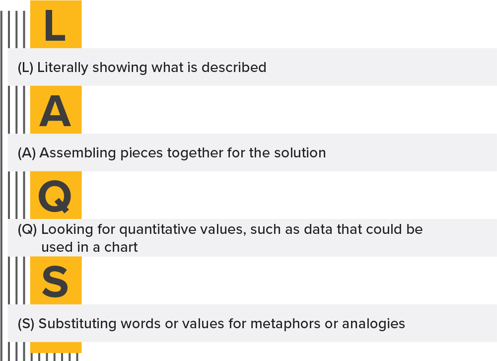
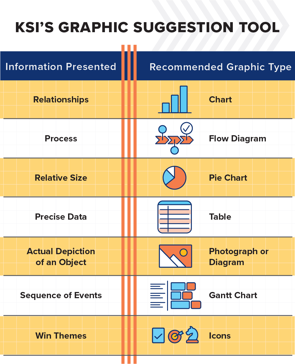
The L.A.Q.S. technique promotes strategy and collaboration between writer and designer. Remembering that both work meticulously, proposal graphics can leap forward in quality. The idea is not to crank out as many graphics as possible. It is to thoughtfully map a solution and tell a story. We want the evaluator to see the solution presented in the proposal. Stumped on where to start? Below is a short "cheat sheet" for proposal graphics.
Conclusion
Let’s wow the evaluator! In a world of proposal graphics limited by font size, margins, and page count, what better way to counter it than by using the toolkit of communication and collaboration? For years, proposal graphics development has stayed relatively the same. Let's change it up. Collaborative visual storytelling will help build new, exciting methods of narrating a solution and enhancing proposals.
Sources:
Good Design is Goodwill by Paul Rand, Graphic Theory, Readings in the Field, https://www.paulrand.design/writing/books/good-design-is-good-will.html
24hr blog article: Should I use storyboards
Should I use storyboards? | Design to Win (24hrco.blogspot.com)
24hr blog article: Getting Your Technical Staff to Value and Use Graphics Effectively
Getting Your Technical Staff to Value and Use Graphics Effectively | Design to Win (24hrco.blogspot.com)


