It is generally accepted that people remember more of what they see than what they read or hear. Also, as a proposal professional, I can testify firsthand that a document of technical text unbroken by visuals is the greatest sleep aid a person can get—no prescription required! For those two reasons, graphics are key to effective proposals. If you want your evaluator to remember a key feature or aspect of your approach, buoy it with graphics. That said, a poorly introduced or displayed graphic can be self-defeating. Even the most eye-catching and substantial graphics can be missed or skimmed if not properly laid out.
The purpose of this article isn’t to discuss what makes an attractive or informative graphic. Rather, we will provide five tips on how to best layout and couch your graphics to achieve good document design and ensure the evaluators notice, comprehend, and correctly interpret your visuals.
1. Properly introduce and place graphics within your text
When presented clumsily, graphics can disrupt the reader’s flow and cause them to miss important content. If a graphic is too far from the text that introduces and discusses it, it loses all relevance and is more likely to be skipped or unnoticed. For example, let’s say you have a graphic illustrating your company’s safety scores. You introduce and talk to it in your facility management section, but due to spacing and formatting issues, it’s located two pages away on a page mostly centered on your financial management approach.
First of all, the reader is unlikely to search for a graphic that’s two pages away from where it is first introduced within the text. Second, because the graphic is irrelevant to the text surrounding it on the page, it will derail the reader’s flow and veer their attention away from your writing.
Figure 1. Introducing a Graphic Effectively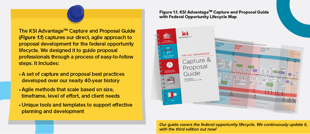
The graphic is kept near where it is introduced and numbered within the text. The reader can easily see and corollate it thanks to effective grouping.
Effectively introducing graphics is easy. First, number your graphics sequentially in their figure title and within the text as they are introduced. Introducing the graphic is as simple as providing the figure number in parenthesis at the end of the sentence most relevant to the graphic, as seen in Figure 1, underlined in red. Numbering helps you organize your graphics as you figure out where to incorporate them within your layout. For the reader, consistent numbering and introduction correlate the writing to the graphic and cue the reader when they should refer to the graphic. This gives you greater control over the flow of their reading.
Follow the design principle of “grouping” by never placing your graphic more than a page away from where it is first introduced in the text. Grouping means to put pieces of related content near each other to create easy-to-read blocks. Grouping can also be facilitated with white space or headings. The simplest way to group graphics, though, is to just make sure that the graphic is as near as possible to the relevant text where it is first introduced and numbered.
2. Write an action caption
An action caption appears after a graphic’s label, usually directly below or above the graphic itself. Action captions should convey the message of the graphic and showcase a feature and customer benefit. For example, a good action caption for a graphic labeled “Figure 3.3. Company X’s Proposals Per Year” might be:
“Company X has doubled its proposal output over the last two years since partnering with KSI. We have successfully guided them through all phases of the procurement process.”
Figure 1 above both depicts an action caption and has one for itself. The action caption inside Figure 1 informs the customer that our guide covers the entire federal opportunity lifecycle (conveying the graphic’s message) while also letting the reader know that we continuously update the guide (adding a feature/benefit). The action caption written under Figure 1 also conveys the graphic’s message and showcases a feature (grouping) and benefit (easier reading comprehension).
3. Use graphics to reinforce your text, not replace it
Graphics should never be used to replace text. If a graphic is used to substitute overcomplicated writing, it will be an overcomplicated visual. Also, a graphic presented without context can leave readers unguided as they attempt to interpret it and might be ignored. Written text must explain your story, and graphics must illustrate it by providing a new way to interpret data. Text and graphics must connect and work together. Otherwise, your graphic stands alone and ineffective, and the reader feels lost.
Figure 2. A Graphic Replacing the Text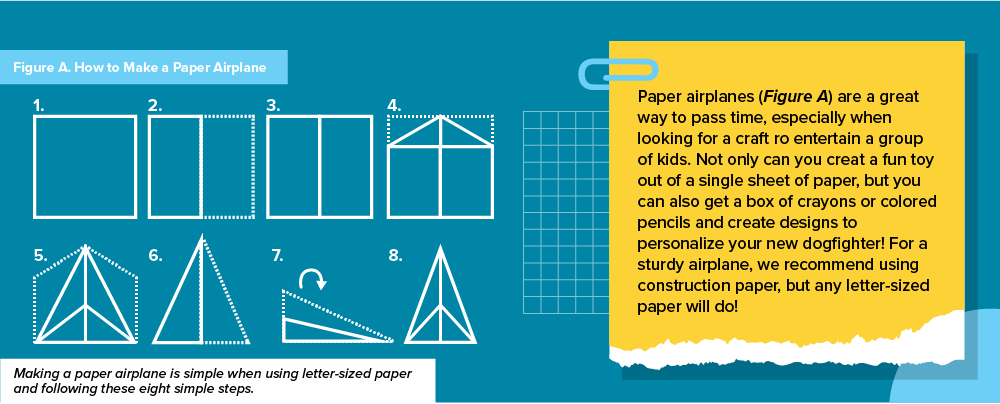
Though this graphic depicts a process, there’s no context to it. The graphic replaces any text that would have been devoted to how to make the paper plane. The reader is forced to rely on the graphic alone to understand the process, which may not be enough.
Figure 2 above depicts an example of the graphic replacing the text. It may convey a process and tell a story, but because that process isn’t discussed within the text itself, the graphic is left out on its own without the benefit of context. This is jarring for the reader, who gets distracted by the isolated graphic hanging outside the text's story. This lack of cohesion may lead them to discount, skim, or ignore the graphic entirely. Figure 3 below depicts the same graphic, but instead, it supplements rather than replaces the accompanying text.
Figure 3. A Graphic Supplementing the Text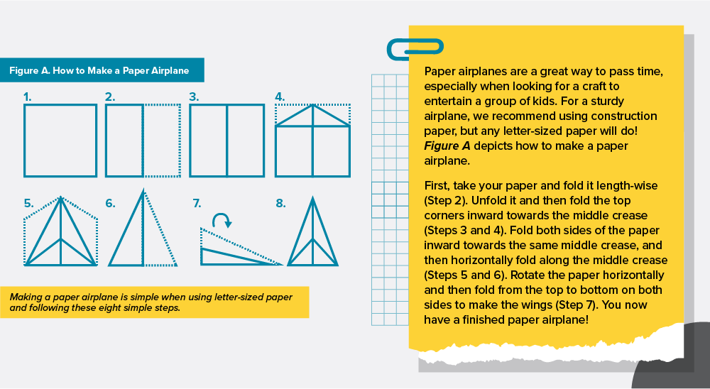 Here, the graphic supplements the text rather than replaces it. Context is provided that guides the reader on how to interpret and use the graphic.
In Figure 3, the reader is guided through the process of making the airplane instead of being left alone with the graphic and unrelated text. The graphic, though still the same eight-step process as seen in Figure 2, is more useful to the reader because it substantiates rather than replaces any text. The reader is more likely to take notice and comprehend your graphic and text when the two are made symbiotic.
4. Beware of font size. Never morph your graphic.
Most RFPs have font and text size requirements, including for tables and graphics. First, ensure your graphic artist is aware of them so that all your graphics comply with RFP requirements. A best practice is to share the RFP with your graphic artist so they can review all the requirements, including requirements for margins, font, and text size. Once you have your compliant graphics, be careful not to morph your images when inserting them into the proposal. It’s tempting to stretch an image for aesthetic or space purposes, but doing so risks compliance.
Figure 4. A Morphed, Noncompliant Graphic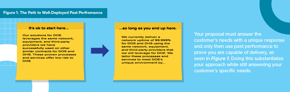
Look at Figure 4, where the graphic has been shrunk to take less space. Though the text and graphic share a font, the graphic’s font size is much smaller than the text. This could be a compliance risk if your RFP has strict font requirements.
Figure 5. A Carefully Inserted, Compliant Graphic
Ask your artist for help if you have font requirements but need to adjust the graphic size. It is wise to adjudicate inserting images to your graphic artist or desktop publishing person so they can expertly add them to your document without morphing. In Figure 5, for example, the graphic has been inserted to keep its font the same size as the text. It takes more space, but it’s compliant, and that’s more important.
5. Balance your layout
Like grouping, “balance” is a design principle. Your document should look balanced (i.e., text and graphics on one side of the page should offset text and graphics on the other). This doesn’t mean each page needs to be perfectly symmetrical; it just means if you are putting a graphic on the right side of your page, for example, you should balance it with text on the left, as seen in Figure 6.
Figure 6. Balance vs. Imbalance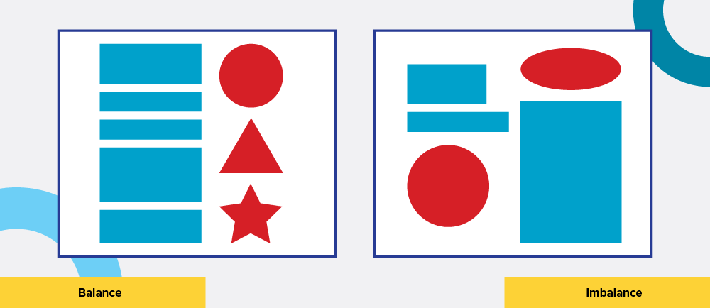
Be sure to remember “weight”—the concept that certain items on a page or screen demand the eye more than others. A graphic, for example, has more weight than plain text. Color has more weight than black and white, large items have more weight than small items, and motion has more weight than static, etc. Use the concept of weight as you balance to ensure the reader doesn’t spend inordinate focus on one part of the page at the expense of the other. For example, in Figure 7, you can see that the web page has been designed with a two-column grid, with the text on the left counterbalanced by the weighty image on the right.
Figure 7. A Balanced Web Page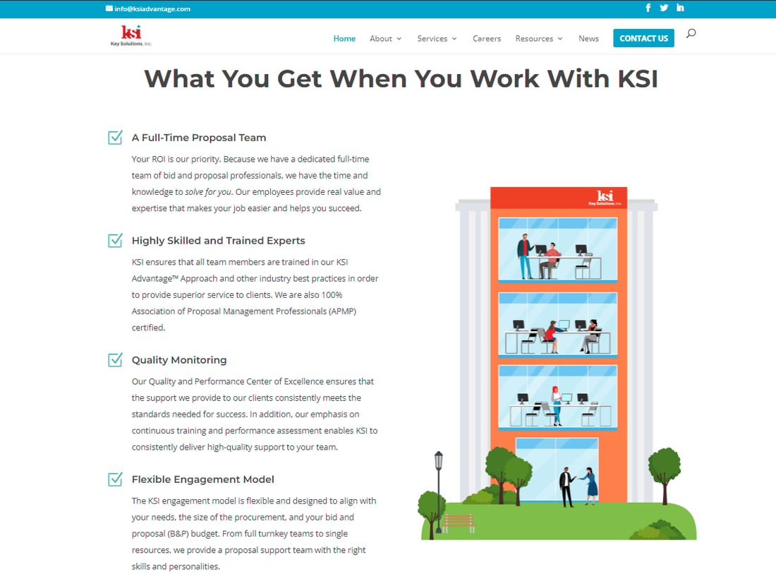
It’s helpful to keep in mind that, for letter-sized, 8.5” x 11” pages, graphics are recommended to be either half a page or full width to save space for body text. If a graphic is five inches on a letter-sized page, the space next to it won’t be enough for body text and, therefore, wasted.
Conclusion
There’s more to having effective proposal graphics than the actual content and design of the graphic. Without solid couching and layout, you risk the evaluator skimming, missing, or ignoring your graphic, wasting the efforts of the writer and graphic artist who developed it. Strong graphics are key to holding your reader’s attention, and proper couching and layout are how you ensure your graphics work as intended. Looks aren’t all that matters, but an attractive layout makes your proposal easier to read, evaluate, and score, and yes, award!