Writing templates are one of the first steps to complete once the draft and final solicitation are released. A writing template serves as the base of a successful proposal. Proposals have historically been heavily restricted in formatting and design, especially proposals for government contracts. Each solicitation varies in terms of formatting requirements. Designers must be strategic about incorporating a superior design into the proposal while adhering to each requirement. With the assistance of a skilled graphic designer or desktop publisher, you can create a cohesive and impactful proposal design that best presents your company’s offer.
This article discusses the important elements of a writing template and provides guidance on creating one. We will cover essential factors such as font size and style, branding, the cover page, margins, headers and footers, visuals like tables and graphics, and the table of contents.
Let's dive in!
Font Size and Style
When working on federal proposals, it is common to see the same font styles, such as Arial, Times New Roman (TNR), and Calibri. On rare occasions, offerors have the opportunity to select a font style from within a font family such as serif or sans-serif fonts. TNR font style is considered the most traditional for federal proposals, and as a serif font, it is the easiest to read when printed. Since most proposals are now submitted electronically, Arial has become a common font style choice because it is a common sans-serif font, which is the easiest font style to read on a screen.
If you are given the option to select a font style for your submission, you may consider the font beyond a printed or electronic submission. For instance, Arial is considered a more modern, cleaner style choice, whereas TNR can save you more space than Arial because it is not as wide of a font style.
Depending on the solicitation requirements, font size is another element to consider when building a template. You can use the font size to emphasize headings, themes, or messages to make them pop. For instance, you can create a main Header for the volume title that is bigger than the body text so it stands out on the page. You can also make the headings different sizes for the varying heading levels, so long as they are compliant. For example, Heading 1 can be 18 point font size, Heading 2 can be 16 point font size, Heading 3 can be 14 point font size, and so on. This helps catch the reader’s eye and calls attention to section changes or important points being made throughout the bid.
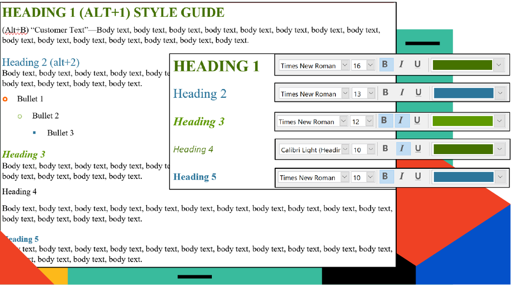
NOTE: The heading size is dependent on the solicitation requirements, and therefore, it is not always possible to adjust the font size. Another element to consider is page count. If the proposal is extremely page-restricted, then using larger font sizes (although allowed) may not be a good use of valuable space. It is important to consider these sorts of details when building your template.
Branding
Branding is the best opportunity for your company to show some color and make your proposal stand out. From your company’s approved branding, color palette, and logo, you should have a variety of colors to choose from. Using color in the headings and graphics not only helps your proposal stand out but also creates a consistent look and feel that aligns with your company or team’s branding.
Some logos have fewer color options. For this scenario, it can be helpful to decide on additional colors to complement your primary selection – three primary and three secondary colors will give you a solid starting point.
NOTE: Some logos include the color red. In this case, we recommend not using it as a primary color source. If your proposal or graphics are saturated in red, it can give a “negative” impression or interpretation. Consider using red sparingly and as an accent color.
Cover Page
The cover page plays an important role in the proposal, especially with the significant shift to electronic submissions. A cover page is your first opportunity to make an impression because it is the first thing evaluators see. Cover styles used to be predominantly collaged photos and bid information. With today’s submissions, companies prefer a cleaner, simpler, and more modern approach to designing a cover. Negative space has a strong impact on the overall design, aesthetic, and readability, making the cover easier on the eyes.
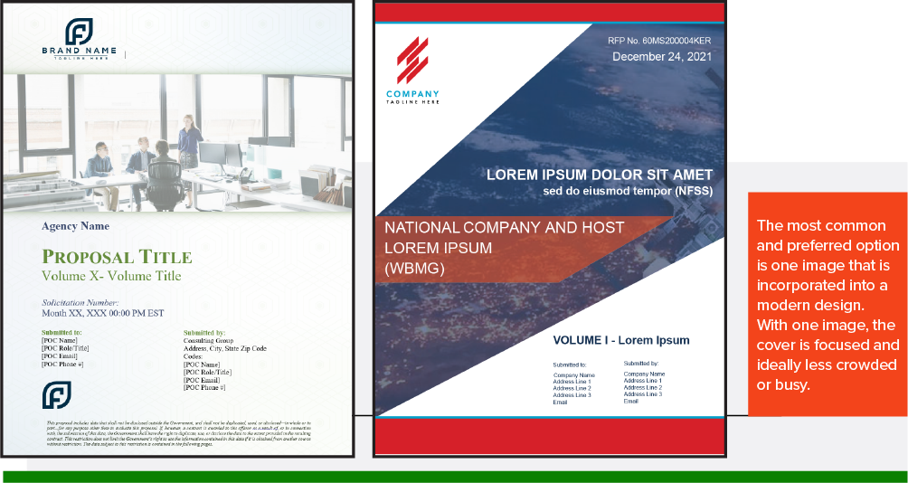
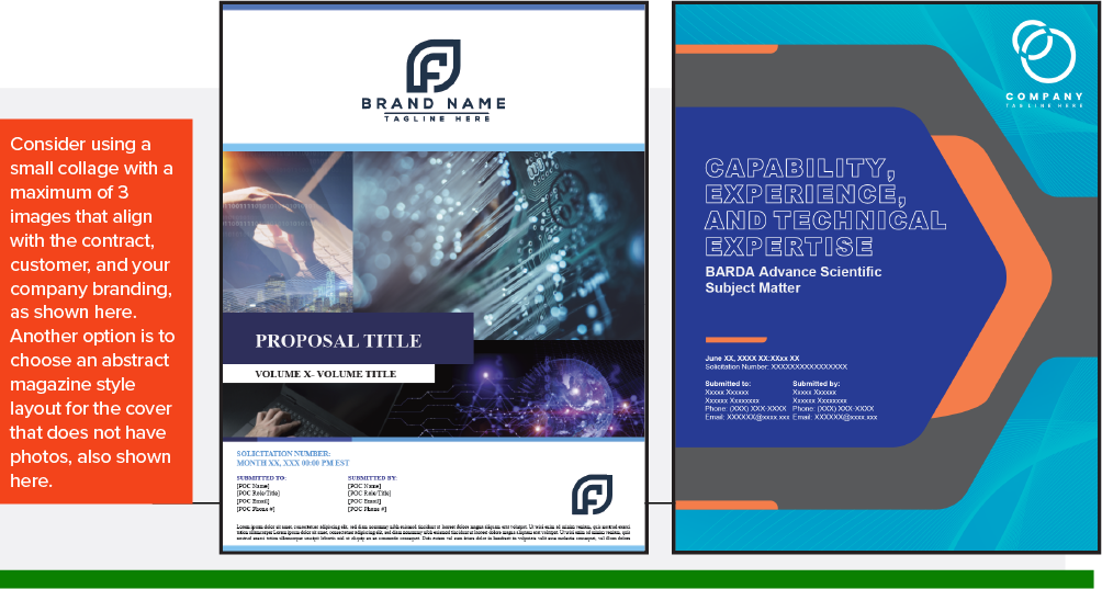
That said, it does not mean you should avoid collages on your cover. Consider using a small collage with a maximum of three images that align with the contract, customer, and your company branding, as shown below. Another option is to choose an abstract magazine-style layout for the cover that does not have photos. This option would only include design elements that align with your company’s branding and tie to the customer agency and/or program. These “photoless” covers are often seen at the Task Order submission level because they can be used across many bids and are easy to customize for each submission.
Margins
The RFP will provide margin requirements. The most common requirement is 1 inch around the page; sometimes, you will see ½ inch around. The top and bottom 1-inch margin is the best option because it provides the necessary space to add information in the header and footer, such as the page number, title, and more. When the RFP doesn’t provide margin requirements, the ½-inch margin is the best option if the document has a limited page count and a 12-point font size requirement.
Headers and Footers
Now that the font requirements, margins, headings, and cover have been incorporated, it is time to address the headers and footers. When creating the headers and footers, review the solicitation documents. Many times, there are requirements you must adhere to regarding the information that must be included in the headers and footers of your proposal documents. If there aren’t any header and footer requirements in the solicitation, refer to your company’s branding style guide as a reference or starting point. For the header, it is most common for the logo to sit on the left side of the page and the opportunity information to sit on the right side. It is also encouraged to include the solicitation information on the right side of the header.
For the footer, include proposal information, such as the page number, volume information, due date, and disclosure. Again, this information's order and location depend on the solicitation requirements.
Both the header and footer should have designs that align with company branding and the opportunity-specific color palette. Headers and footers are other elements that help create a cohesive design across the entire proposal.


Visuals
Let’s not forget graphics and tables! Of course, graphics are an important part of the proposal and are used to demonstrate and depict complex processes and solutions visually and clearly. Graphics also help break up pages or “walls” of text, which makes the proposal easier for evaluators to read.
For more information about graphics, read our article, 5 Layout Tips for Proposal Graphics about the importance of graphics and how they can help lead to a winning proposal.
The graphics and tables used in the proposal should align with the colors used throughout the template. It is a best practice to include a separate style in the template for Figure headings and Table headings. By creating different styles for each of these types of visuals (graphics and tables), you can more easily create the List of Tables and List of Figures for the Table of Contents (TOC).
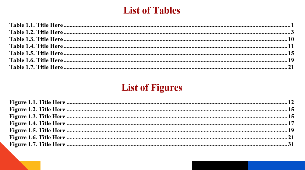
Table of Contents
The Table of Contents (TOC) is an important component of a proposal template because it enables the evaluator to easily find the information or section they are looking for.
In Microsoft Word and PDF, you can create links in the TOC to the main section headings, as allowed. This is helpful for the evaluator because it allows quick navigation throughout the proposal to the section(s) they want to read/review. It also allows the evaluator to see how the proposal is structured and where topics/requirements are covered in the response.
To create a TOC, follow these steps from Digital Trends:
Step 1: Go to each page of your document and implement a heading style to the title via the Home tab, then select Styles.
NOTE: You can also choose to apply subheadings that provide navigation support and context to the structure of a document. Having multiple levels of headings (Heading 1, Heading 2, Heading 3, all the way to Heading 5), allows you to populate the Automatic Table of Contents. Using the automated feature in Word to create your TOC is straightforward and makes for easy updating as the document evolves over time. If you make any changes in the proposal, the automated TOC ensures they are reflected in the headings.
Step 2: Click the area where you want to insert the TOC. Click the References tab and select the Table of Contents button.
Step 3: Choose Automatic Table 1 (Contents) or Automatic Table 2 (Table of Contents), which is only differentiated by the titles each setting will apply. Microsoft Word will now rely on the headings applied in Step 1 to form the TOC, which includes any text where Heading 1, Heading 2, or Heading 3 was applied, as well as the associated page number.
Keep in mind that the TOC heading styles can be modified. You can change the font size and brand colors based on the hierarchy of the heading/proposal structure. This also helps align the proposal, the branding guide, and company colors throughout the document.
Final Template
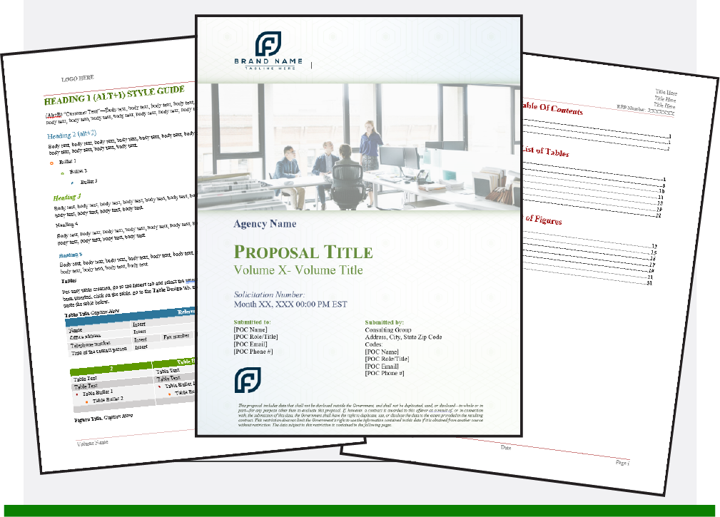
By aligning the elements of the template (detailed above) with your company’s branding and color palette, you will create a modern design that distinguishes you from the competition and demonstrates the care and importance your company brings to the contract.
Conclusion
A good template design will relay your message and information in a way that is easy for the evaluators to understand and delivers the best impression of your company and team. The writing template has become an important part of the proposal development and design process. It gives your team a cohesive and clean starting point. Staying organized from the beginning of every proposal gives you a significant advantage over your competition.
For a deeper dive into desktop publishing best practices, check out How to Use Basic Desktop Publishing Skills for a Proposal.




![How to Create an Effective Proposal Schedule [Examples + Templates]](https://info.ksiadvantage.com/hubfs/Blog%20Images/How%20to%20Create%20an%20Effective%20Proposal%20Schedule.png)
